
TU Platform
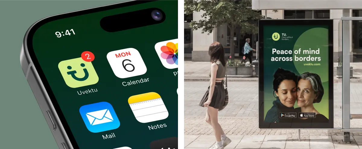
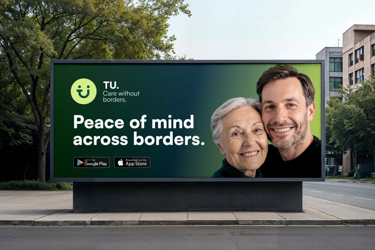
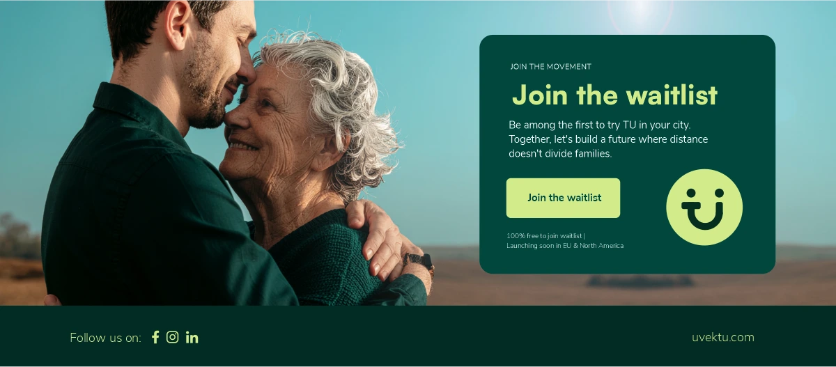
TU is a digital care service built for the Balkan diaspora – people living abroad who carry the quiet weight of worrying about elderly parents and relatives back home. The challenge was to design an identity and platform that holds emotional gravity without being heavy; one that communicates trust, proximity, and care in a single coherent visual language.
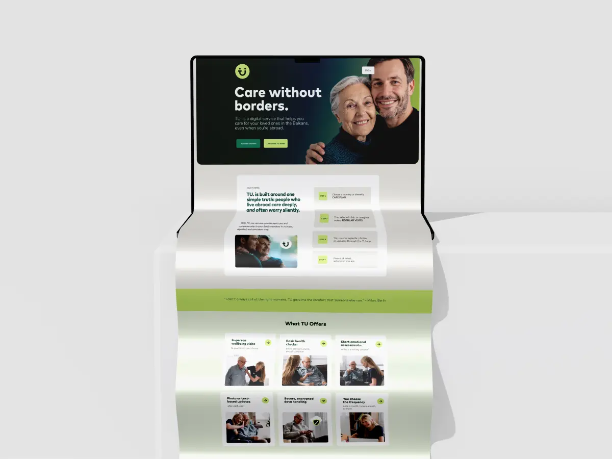
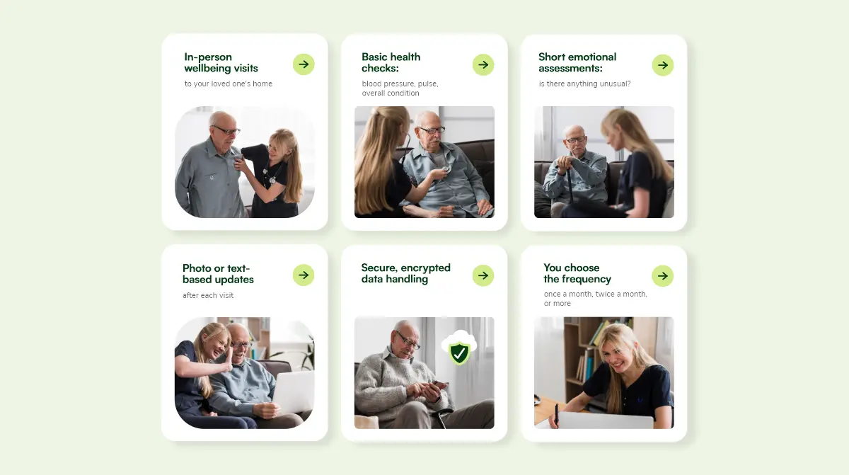
At its core, TU is a service system, not just a product. It connects pre-approved healthcare professionals and caregivers with diaspora families through a structured, pay-per-use model – turning distant concern into reliable action. The design had to reflect this logic: simple steps, human dignity, and the reassurance that someone is always there.
The design approach focused on:
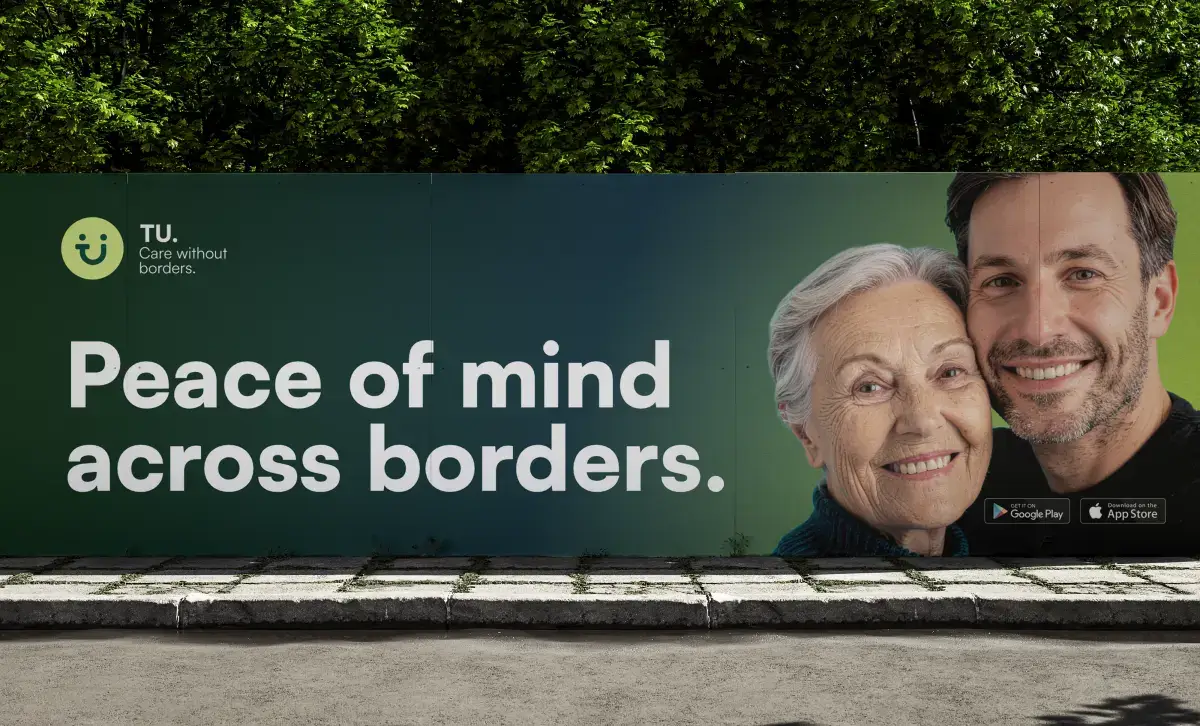
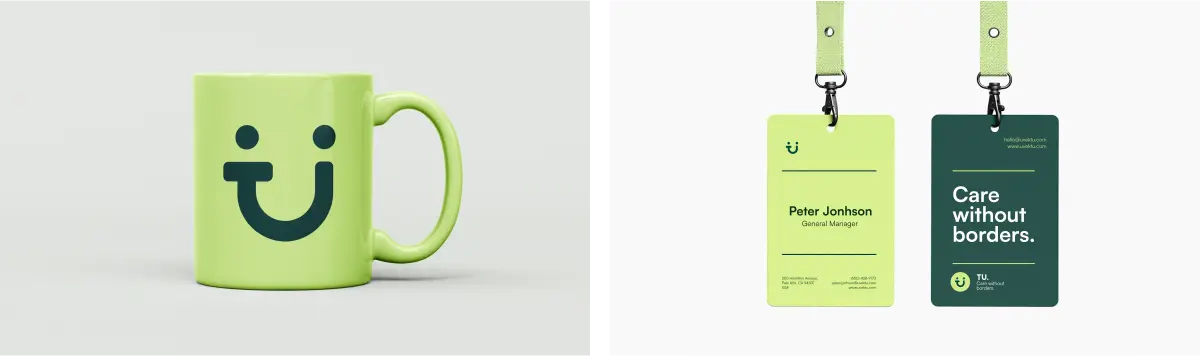
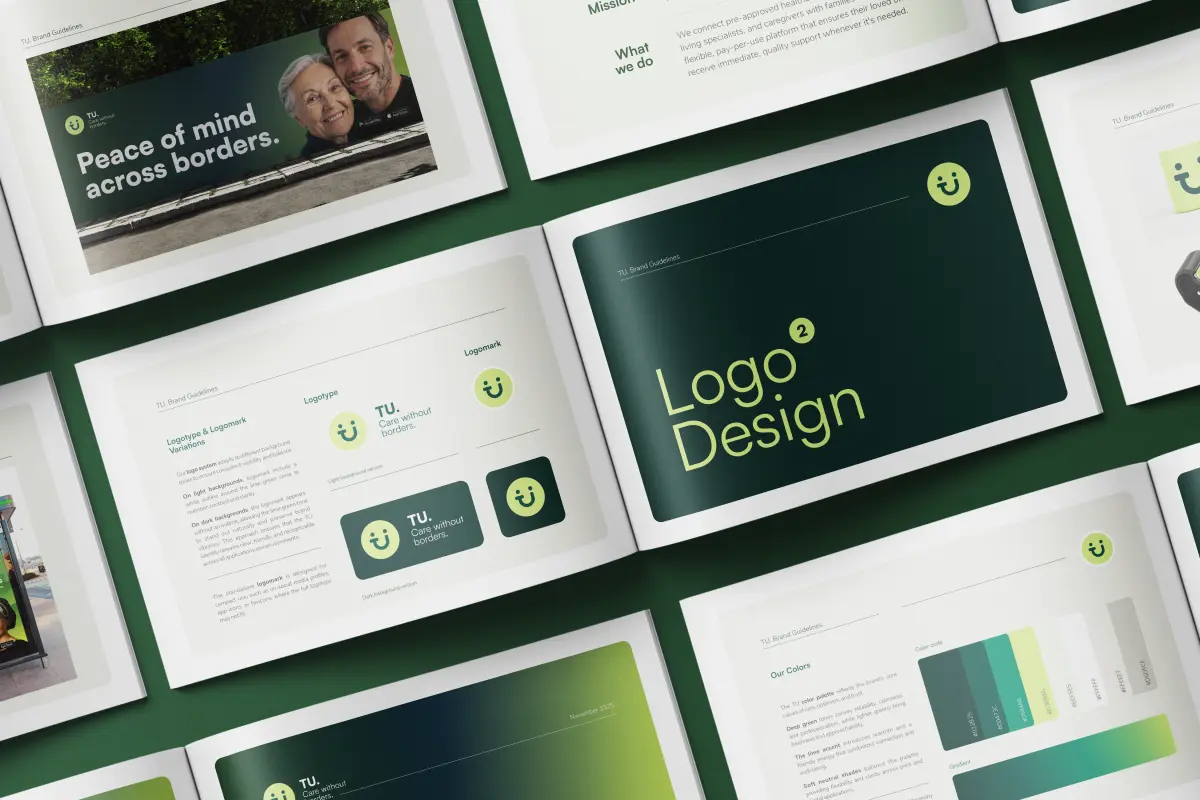
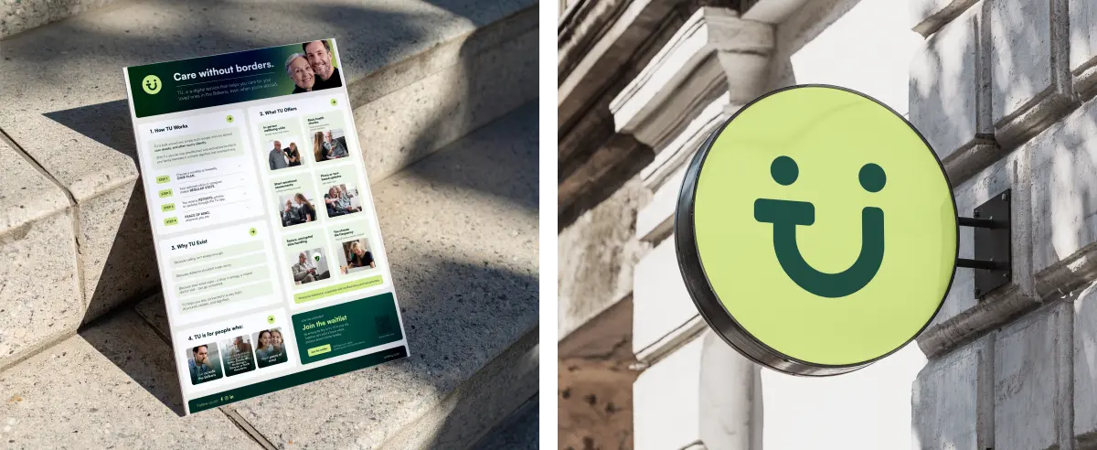
- Identity grounded in meaning, with the name “Uvek TU” (Always Here) informing every visual decision – presence, warmth, and quiet reliability distilled into a mark that carries weight without noise.
- UX clarity over complexity, structuring the service flow – choose a plan, receive visits, get reports, gain peace of mind – into a hierarchy that communicates trust instantly, even to users navigating across language and distance.
- Tone consistency across touchpoints, ensuring the brand voice, visual language, and interaction design all speak the same language: dignified, human, and structured. No unnecessary friction. No emotional manipulation. Just clarity.
The result is an identity system that earns confidence — where every element, from the wordmark to the service steps, reinforces a single message:
Distance is a condition. Care is a choice. TU makes that choice possible.
Task
Design a digital service identity and platform experience that communicates care, trust, and structural clarity for a diaspora-facing healthcare service operating across the Balkans.