


Manifest
Manifest brings physical training, restorative treatment, mindful practice, and conscious nutrition under one roof. The opportunity was to build an identity with enough range to hold all of it, and enough coherence to make the whole feel more deliberate than the sum of its parts.
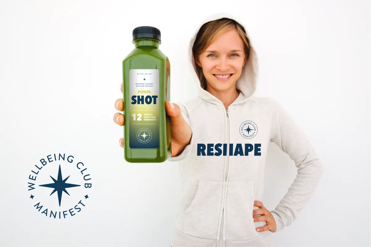
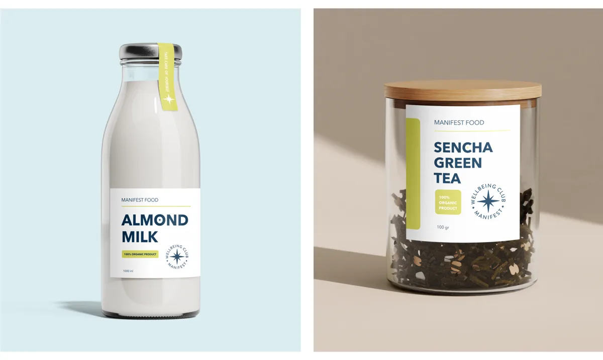
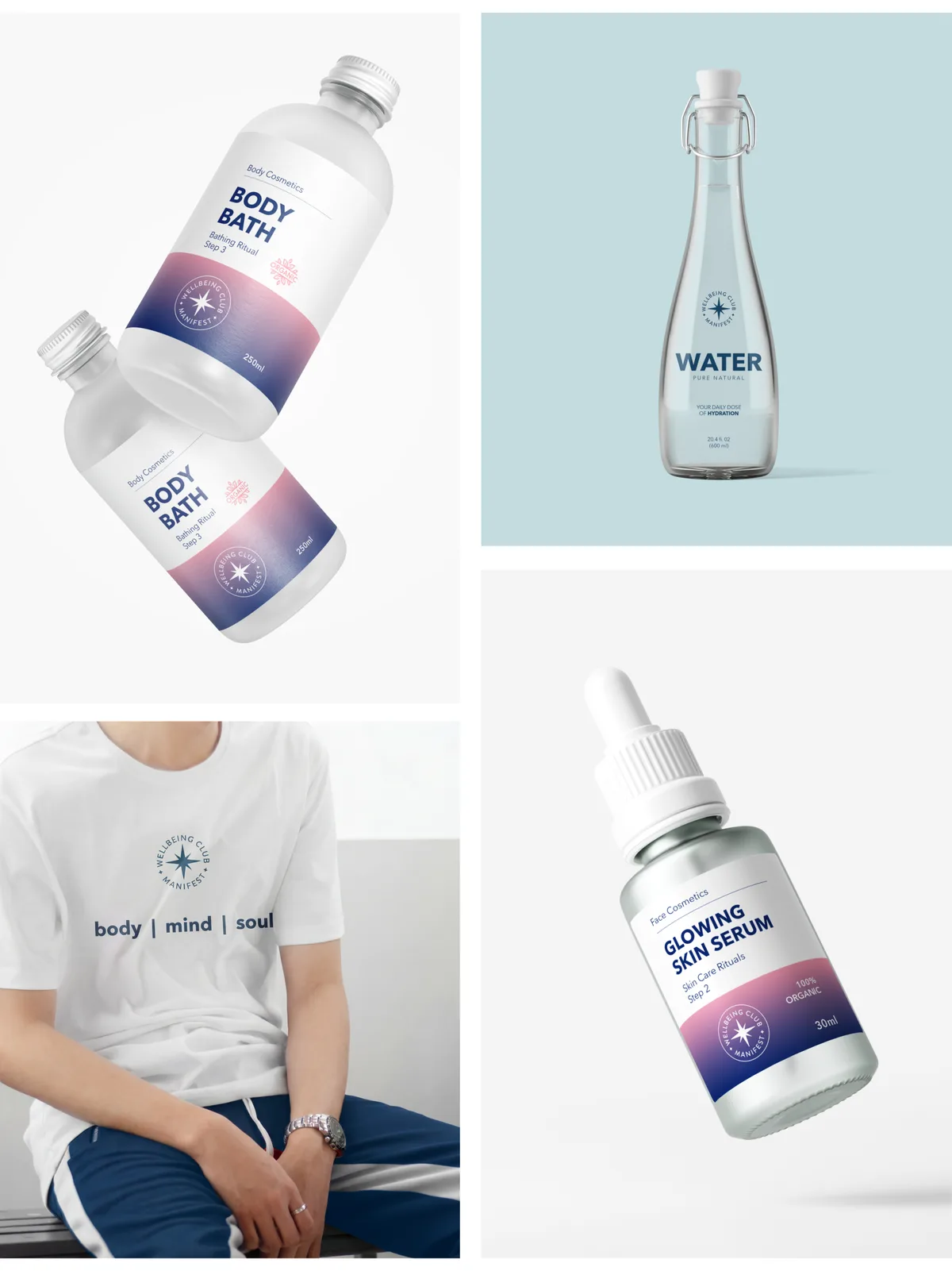
A brand that spans bodywork, movement, mindfulness, cosmetics, and food touches a wide emotional and functional spectrum. The system had to give each part of the offering its own visual territory while keeping everything immediately recognizable as one brand, across packaging, digital, apparel, signage, and environmental communication.
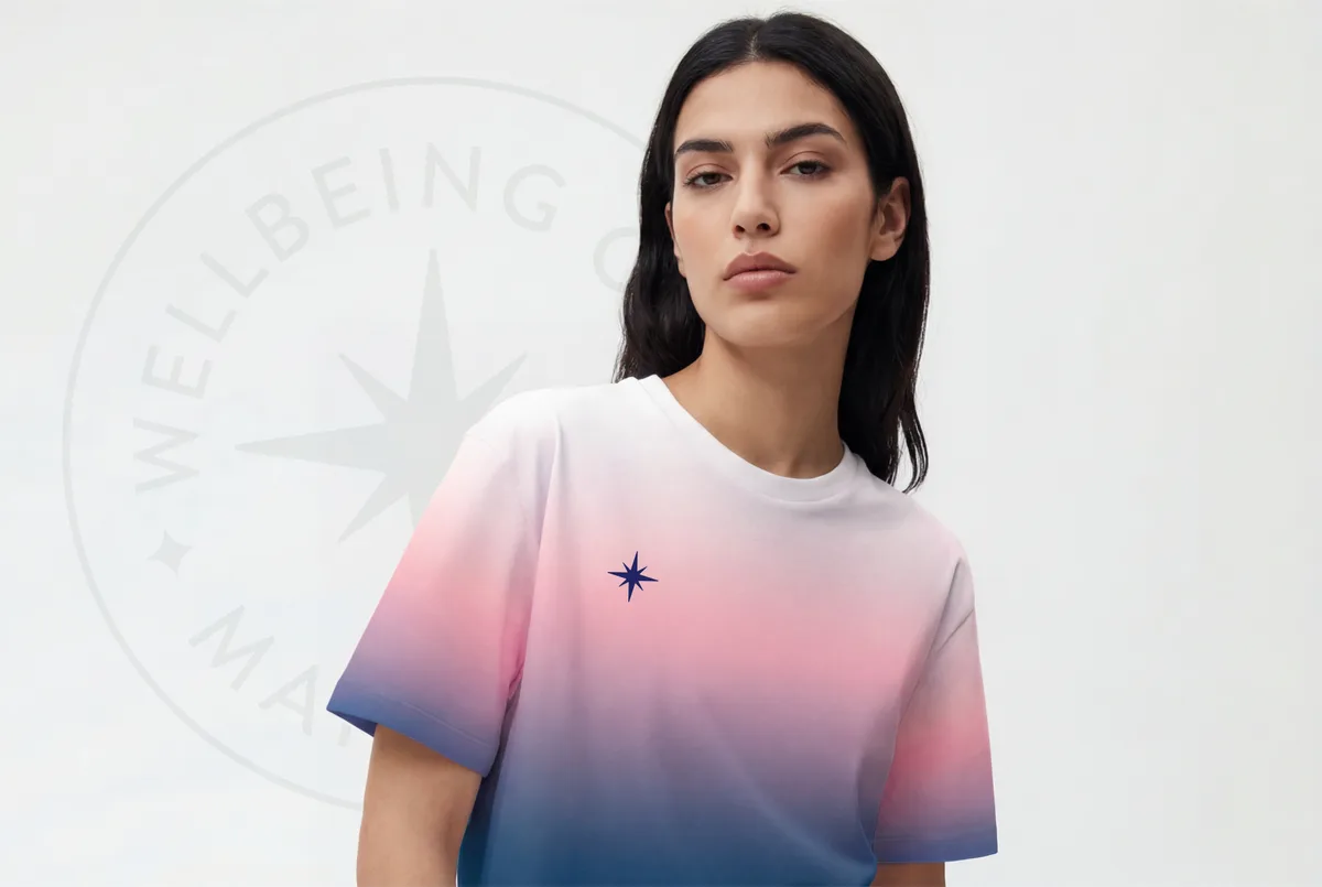
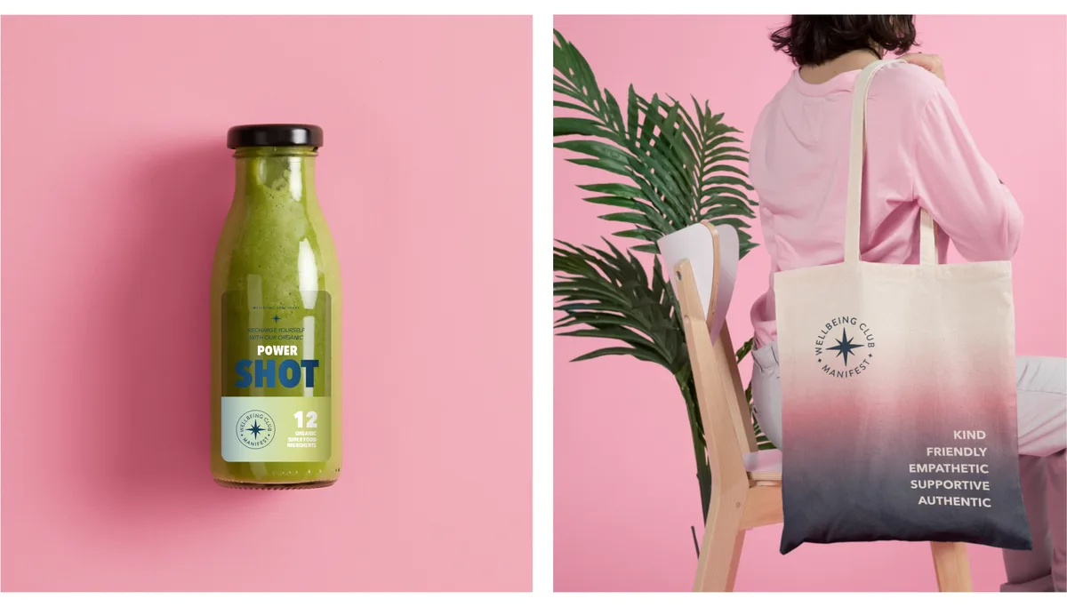
The Northern Star sits at the center of the identity because it earns its place conceptually before it earns it visually. For a brand built around personal transformation, a symbol of orientation and reliable guidance carries specific weight. It anchors the mark, scales from a cosmetic label to a room-sized application, and connects the physical, mental, and spiritual dimensions of the experience into a single idea.
The color system does the same work at a different register. A primary palette grounds the identity in stability and warmth. A secondary set of natural tones extends it into softer territory. A gradient layer gives each part of the offering a distinct visual register within the shared language, so the brand can navigate its own dimensions without losing itself.
The result is a system with enough structural integrity to scale with the business, and enough warmth to mean something to the people it serves from day one:
Designed to hold everything Manifest is, and everything it intends to become.
Task
Develop a complete brand identity system for a wellbeing concept that spans training, treatment, nutrition, and cosmetics, applied across brandbook, packaging, apparel, digital communication, and environmental signage.